Last week, we got to see my mid-1300s paper doll set in black and white. This week, here she is in color. Historical printable paper dolls always make me a little nervous. In inevitably, choices have to be made about what to include or not include and how to render a period’s fashion. These choices are easier the more you know about the period and harder the less you know. One of the reasons I often turn to Medieval inspired or Renaissance inspired rather than actual historical paper dolls is the knowledge that I don’t know enough to always make appropriate choices.
What I am not comfortable doing is always trusting the many sites out there that don’t cite their sources with enough detail to actually find the material if you needed it or want to confirm it’s authenticity. While I love the internet, I find that I don’t use it that much when I am doing this sort of research. I seem to fall back on my library training and rely on reputable secondary sources published in scholars with names in the field, backed up my own knowledge of solid collections of digitized medieval manuscripts where I can dig for source images, plus a few tumblers and blogs that seem to know what they are doing.
And this method worked great until I got down the problem of color. Now, I always think of the 1300s as being richly red and blue and gold, because those are colors I have seen in medieval manuscripts. Just because, however, they made a dress red in a book doesn’t mean the dress was commonly red in real life. Pigments used for illumination aren’t the same a pigments used for dyeing cloth and medieval art is heavy on analogy and symbolism.
What I really didn’t want to do was do a ton a research on natural dye processes, because a lot of people have written a lot on the topic. Textile fragments like this one, an incredible velvet cope or this equally amazing cope from the V&A Collections proved to me that colors were rich in the 1300 hundreds. So, I used those images along with this Medieval Colors article from Aux Mailles Godefroy. The resulting colors are a little more muted than was probably possible in the 1300s, but I just couldn’t get over my preconceived notions of muted tones despite seeing examples of bright yellows produced with natural dyes. The truth is that both linen and wool, common fabrics in the 1300s, take dye really well. The world was likely a lot more vibrant than my preconceived notions of history suggest.
By the way, most of my primary and secondary sources for this paper doll set are listed on the black and white version. It was a long list and I didn’t want to repeat it here. So go check that out, if you want to see what I used to create my mid-1300’s paper doll.
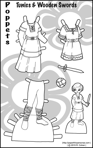
Clearly, I’ve been on a bit of a medieval kick with Monday’s 14th century set and today’s psuedo-medieval Poppet paper doll set. Ironically, I’m not that much of a medieval fantasy fan. As far as book genres, I’m much more into urban fantasy than anything in the classic or epic fantasy genres.
Of course, urban fantasy generally doesn’t lend to crazy paper doll outfit sets.
This set is partly because of my goal this year to make more Poppet paper doll sets. Last year, I only did eight Poppet sets which seems rather like a low number. This year my goal is at least ten. I also really want to do some historical clothing sets for them, since I have an absurd love of Victorian children’s clothing. Those sets, however, aren’t even drawn yet. I think I should finish some of my unfinished Poppet paper doll clothes before I start drawing more of them.
I have a lot of unfinished Poppet sets lurking accusingly on my computer and demanding completion.
Today’s paper doll set features colors in the same family as my Marcus the Warrior paper doll. I almost gave them real swords, but that seemed like a terribly dangerous thing to give a small child, so a wooden sword would have to do. I really do enjoy drawing toys as accessories for the Poppets.
Meanwhile, I have been giving a lot of thought to Copyright and other issues of posting content on the internet. Would people be interested on a post on that topic?
Today’s printable paper doll is from the mid-1300s when set in sleeves came into existence and fashion was all about layers and hanging strips of fabric off sleeves called “tibbets.”
There are topics upon which I can speak authoritatively and there are topics where I know basically nothing. I would say that I am fairly knowledgeable about certain periods of Western dress, but there are others that are beyond me. As someone who just isn’t that into the medieval period in Europe (though it is growing on me), I have never spent much time doing research. After last years adventures in the 10th century, I knew I wanted to explore some more early periods and the 1300s seemed like a smart choice.
I settled on the 14th century (or the 1300s), because I’ve been wanting to illustrate that period ever since I stumbled across the entire Roman d’Alexandre digitized from the Bodleian Library which is full of illustrations of ladies in fashionable dress. As I usually do, I cobbled together my decisions about this paper doll from a variety of secondary and primary sources. One website that deserves a shout-out is Illumanu which not only posts manuscript images, actually cites them properly. Makes the librarian in me so happy.
A few specific choices I should note. The pattern on the sidecut surcoat was from Romance of Alexander from the Bodlein Library. The far left dress is based on this casket lid from the Met and the Romance of Alexander from the Bodlein Library folio 181 verso. The green dress on the far left seems to have buttons down the front and hanging sleeves. The other two gowns are mixtures of literally dozens of primary and secondary sources. You can check out below some of the sources I used.
The stockings are scrunched below the knee. I wasn’t able to find any records of garters being worn in the 1300s. The shoes are both from Stepping through Time: Archaeological Footwear from Prehistoric times until 1800 which I would totally buy if I could find it for a reasonable price. I also designed a new face for this paper doll. I like it a lot, so it might become a regular member of the family. I haven’t decided yet. What do you all think?
I have had a deeply frustrating month of February. My car was in the shop for a week and I got sick. I’m getting over it, but I haven’t been as productive as I would have hoped. We had a snow day on Wednesday and I was hopeful that I would get a bunch done.
Of course, I didn’t get as much done as I had hoped.
Jayla is an older printable paper doll. I showed a preview of her with this set of Pixie preview posts. I think of her has being kin to my floral set for Monica. Both paper dolls have a girly style with lots of floral pattern. I also think I drew them around the same time. These darker floral patterns seem to be in style at the moment. For this winter, I think they make more sense than the various pastel options.
I knew I wanted a “dark” background for my florals (keeping with current tends), but I didn’t want to incorporate too much pink. I tend towards pinks and reds naturally, so sometimes I have to fight that urge. Instead, I chose green, purple and blue as my color scheme. I really wanted to use the lime green with a warm purple, as I love lime and purple, plus Jayla has a good skin-tone for lime green. I have a horrible skin-tone for lime green, which might explain why I foist it upon my darker skinned paper dolls with such regularity.
Jayla’s wardrobe is not the most mix and match friendly. I think she really has about 11 or 12 outfit combinations that make sense and then 13, if you don’t care if things match. Personally, I think she could borrow some shoes from Adannaya who has the same skintone or some pants and skirts from Clarisa or a dress from Fiona. There’s plenty of paper dolls around I’m sure who would be happy to share.
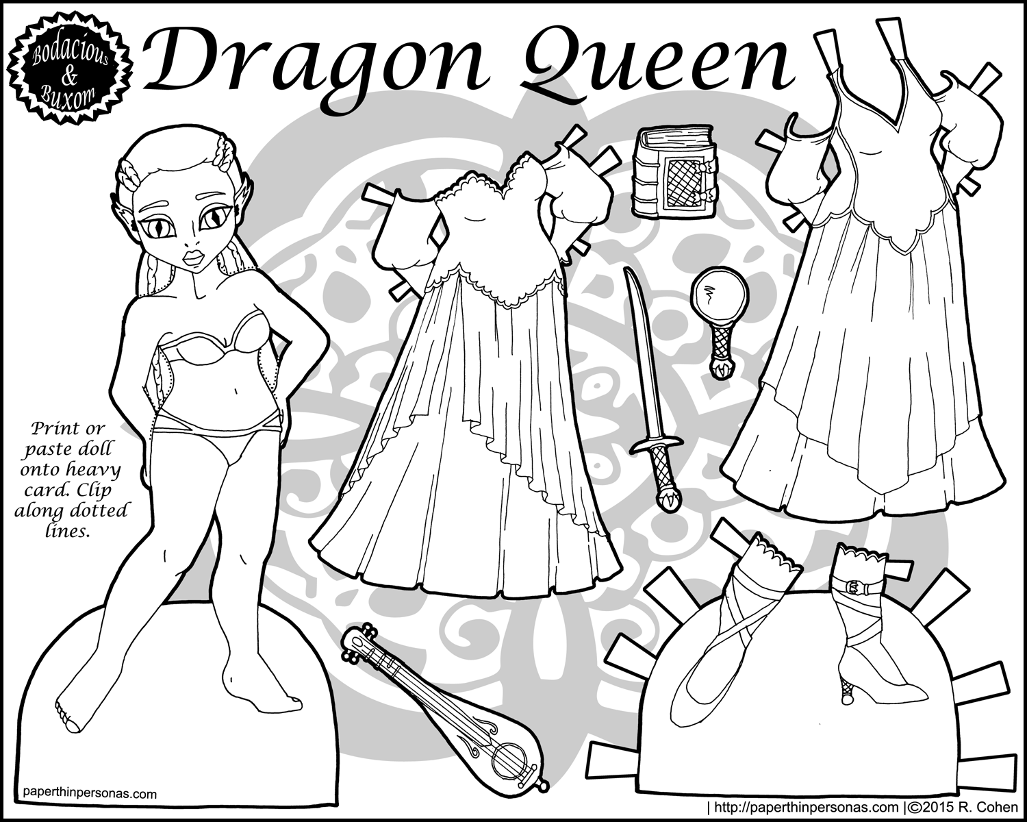
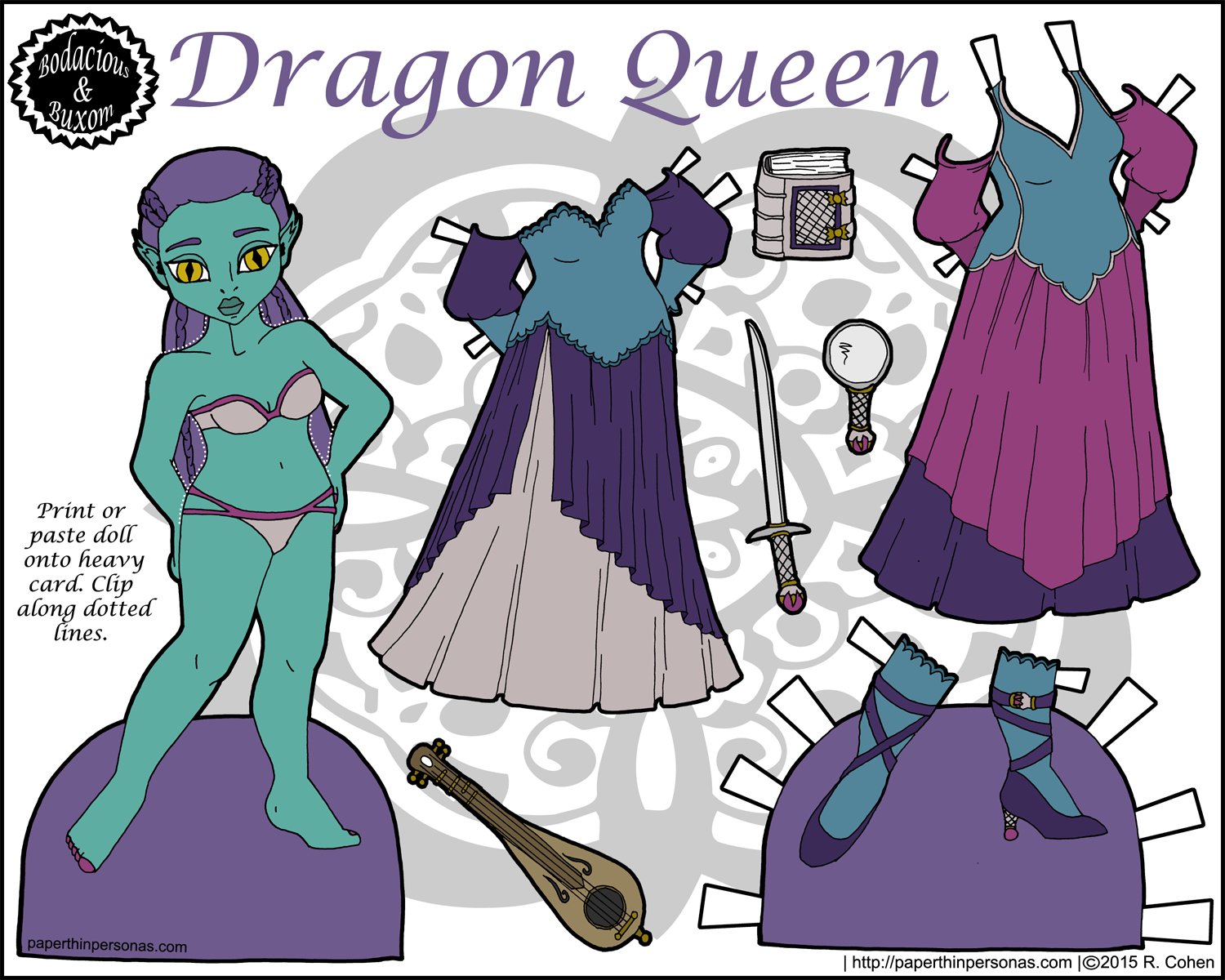
I had grand plans to get my 1300s Marisole Monday & Friends set done yesterday, but obviously that didn’t happen. So, we have Bodacious and Buxom instead with queens & dragons! (Sort of.)
So, when I posted my blog goals for 2015, I didn’t mention in my ten posts for Bodacious and Buxom that I had this post waiting quietly in the wings. Technically, I finished it when I finished the 1940s paper doll set, but I saved it as I don’t like to post two of the same series in a row.
I also have a nearly finished regency combined with steampunk set and a weird sort of farm girl thing in the works.
But today there are dragons, or at least humanoids who have some reptilian features. One of the things that my alchemist paper doll taught me is how many long dresses I can fit on a single page of the B&B series. The answer seems to be two dresses with a pair of shoes and some accessories. As a result, our Dragon Queen paper doll has two gowns, a sword, a mirror, a book and some shoes. Somehow I always imagine dragons as very vain creatures.
In my mind, today’s paper doll is either a dragon in humanoid form or from a species that believes they are descended from dragons. Her homeland is mountainous and rich in minerals. I imagine her people are sophisticated and tend to rely on their innate magic rather than technological acumen to solve their problems. Isolationists, they are uninterested in contact with other humanoid species, but maintain slight contact with the Dwarfs, for their technology and metalworking skills, and minor contact with the Elves, for their magic. Humans are, well, beneath them.
I chose a rich jewel toned color scheme for this paper doll set. I knew I wanted some sort of green skin, but I didn’t want it to feel too “lizard” like. I went with a rich teal. I also wanted her dresses to coordinate with her skin, as though they were chosen specifically to do so. I imagine she is wealthy enough to have her clothing tailored to match her coloring.
I’ve been hesitant to post blog goals this year. I don’t want to be too ambitious, so I am going to keep these fairly simple. Ideally also concrete, so that when I check back on them mid-year, as I usually do, I have some idea how I have done.
1. More Historical Paper Dolls. I want to create ten historical paper doll sets in 2015.
Ideally, I want to work in periods that I have done in the past, but also some periods that will requite lots of research. Right now, I am planning on a Tudor set, a Viking set (they won my poll), a 1300s set, and a new 1920s set for Marisole Monday & Friends. I also want to do some historical guys, so I am thinking a Victorian guy and an 18th century guy (probably Marcus, but maybe Puck… Puck needs a redraw.) I’m also planning on some historical children’s clothing for the Poppets, likely from the 1920s to 1930s, as those are one of my favorite periods for children’s clothes.
2. Focus a little more on Poppets, Ms. Mannequinn and Buxom and Bodacious.
These three series are my most neglected. I have a bunch of unfinished Poppet sets and a bunch of unfinished Ms. Mannequin sets. I want to really buckle down and get some of those sets done. So, my goal is to add at least ten sets to each of these series by the end of 2015.
3. Do more Featured Artists.
Okay, this is totally a goal from last year, but I want to keep it up this year. I think that it is really important to see what people say about paper dolls and there aren’t a lot of us around and I want to try to build some community among us.
4. Actually send something into OPDAG Newsletter.
I am SO BAD at this. I always promise myself I will and then I don’t and then I feel guilty. Anyway, this year I am going to buckle down and even if I don’t like the theme, I am going to make something for the newsletter, darn it! I am! The next two themes are Favorite Mysteries and Chanel. I can do something for those. I know I can… I just have to not procrastinate.
5. Have another Mini-Series set.
Last year, I spent ten weeks posting my Her Ladyship paper doll set. It was so much fun to get away from my series for a while and play. She also got a great response, so I want to do another mini-series this year. I have no idea what the theme will be. I have to think about it.
6. Upgrade the images on the blog to larger format images.
Back when the blog started, I used smaller images (350 pixels wide- to be precise) for my post images. One of the things, I want to do is update these to larger images for the blog, since I think the larger images look nicer and since the internet is no longer quite so slow for most of us. This is going to be a very long, rather painful, slow process.
One of the things I really love to do is hold drawings where the winner gets a custom paper doll. Part of the fun of these contests is that I never know what people are going to ask for and sometimes I am really surprised.
As always when I create one of these paper doll print outs, a part of me is very nervous. I always worry that I am not going to “get it right” for the person who asked for the paper doll set.
Morgan asked “For the clothes something comfy but still sort of dressy, tomboyish but still girly, if that makes any sense. For the hair color and style, curly long orangish red hair, blue eyes, and freckles. But if possible I would love to have the color theme be turquoise.” And she was kind enough to send me some great reference images.
As I usually do with drawing winners, I wanted to post both of these sets at once, as I don’t think it is nice to make my winners wait when they have been so kind to wait a few weeks anyway.
Color scheme wise, I was asked for turquoise which is one of my favorite colors (well, teal really). Beyond being really hard to spell, it’s also a color with lots of variation. Since it can be a fairly green color or a fairly blue color, I wanted to use several shades. Now, I tend to stay away from monochromatic schemes, so I also used a bright yellow and a bright green as accent colors.
Anyway, I hope you like your paper doll set Morgan and if the color scheme isn’t quite what you imagined, let me know. I can recolor her. I always worry about color schemes. Meanwhile, to my other winner, I promise your paper doll will be up in a few weeks.
By the way, I think this is the first contemporary paper doll I’ve ever done with just pants and no skirts or dresses. I haven’t been through all the archives to confirm that, but I think it’s true.
Inspired by Victorian and Art Deco valentines, I designed two 18th century inspired gowns with a Valentines Day theme. Hearts, of course, but also stripes and polka-dots. Plus ruffles. Ruffles are very important. Our paper doll got a wild up-do and a heart encrusted bodysuit to wear under her gowns. After all, it is the season for both wide up-dos and heart bodysuits.
Originally, I planned on using a traditional red, pink and white color scheme. However, I just didn’t like how bright that made the dresses. So, I went to ColourLovers and searched for a scheme that was a little more subdued. I ended up using Happy Valentines color scheme. I often use ColourLovers both to find inspiration for color palettes and to build my own color palettes using their tools.
I hope everyone has a lovely Valentine’s Day. I am making stew for me and my boyfriend and we’ll be eating it while watching Box Trolls. I am very excited about both the stew and the movie.
Meanwhile, there’s supposed to be snow on Monday and I have become a true Southerner, buying milk and eggs, just in case. I certainly wouldn’t mind an unexpected day off work, since I don’t get President’s Day off.
After I wrote my tutorial on how to clean up line-work, it occurred to me that I should talk a little about scanning. I didn’t have space to do it in the linework tutorial, but I do have a few thoughts on scanning. Here’s some advice from someone who scans a lot both for my hobbies and for my job where I usually am the one digitizing historical materials.
Scan in High Resolution.
When I was first learning how to cut wood, I was taught- You can make a piece of wood shorter, but you can’t make it longer. In other words, cut a little bigger if you have to choose. Since slicing off an inch is easier than realizing you’re short an inch.
You can always reduce the resolution of an image, but increasing it will result in loss of clarity.
Resolution is something people seem to get confused about, so let me try to explain. Resolution is always measured by the number of dots per one linear inch (in the US, other places use the centimeter). This is shortened to DPI (Dots Per Inch) for as most printers or Pixels Per Inch (PPI) for digital media.
No matter how high PPI (Pixels Per Inch) your image is, the internet has a resolution of 72 PPI. Meaning, if you create an image that is 200 PPI and measures two inches tall, when you post it on the internet it will appear to be 5.5 inches tall. ((22 PPI * 2)/72PPI = 5.5)
Some professionals work as high as 1200 DPI, but I think that’s a bit much. Bare in mind that professional publications are usually printed between 300 and 400 dpi.
Choose your File Format Carefully.
There are many digital file types. I’m going to talk about a few common ones here.
“JPEG” stands for Joint Photographic Experts Group- a fact mostly useful to show off your knowledge, but won’t really matter much. It is sometimes also called a .jpg or a jpeg. JPEGs are always compressed files. JPEG is designed for compressing either full-color (24 bit) or grey-scale digital images of complicated real world images (photographs). It is a great format when there is subtle color change in an image, but using a high compression rate can result in loss of quality.
“GIF” stands for Graphics Interface Format. It is an 8 bit format meaning that maximum number of colors supported is 256. GIFs are always compressed and rarely used these days.
“PNG” stands for Portable Network Graphics format. This was an updated version of the “GIF” format and literally supports millions of colors. It is the format I usually use for my web posts as it tends to compress to a small size without loss of detail and my paper dolls are full color without a lot of subtle shades. PNG has largely replaced GIF on the internet.
“TIFF” stands for Tagged Image File Format. TIFF was originally designed for scanners as a universally acceptable format in a time when scanning companies all had different formats they were using. TIFF images are not compressed as a default setting. This is the preferred format for archival scanning, because there is no compression. However, the lack of compression results in very large sized files. Therefore, TIFF files are rarely posted or shared on the internet or printed from. TIFF files can handle bi-level (black and white), grayscale, palette-color and RGB full-color images.
When I scan, I scan at 600 dpi as an uncompressed TIFF files in greyscale, since I work in black and white.
Save your raw files.
I call my rough scans “raw files”. Theses are my 600dpi uncompressed TIFF files, usually in greyscale. They are very large files.
I keep them in a folder called “Raw Files” it contains all the raw scans dating back a long long way. Sometimes, you have to go back to the very beginning, so keep a copy of the unaltered scan in case you need it.
Hopefully you won’t, but if you do than you’ve got it. I have only had to go back to these files once or twice over the years, but I have been grateful I had them if I needed them. (Usually, because I accidentally deleted something.)
Know you Scanner and Choose it Well.
I have used HP scanners, Epson scanners and Canon scanners. They are all a little different. Learn your scanner settings. Read the manual. Get comfortable using it.
If you are scanning full color art work, than carefully check how many colors the scanner can read. A colored pencil drawing, for example, can literally have millions of subtle shades. If your scans are coming out poorly, than is it your scanner? Your scan settings? Or can your scanner just not handle the color depth.
I don’t own an expensive scanner. I use an all in one printer with a cheap scanning bed. I work in black and white, so I don’t worry about color loss. If you do worry about color loss, invest in a good quality scanner. If you do invest in a good scanner, avoid letting it get bumped or knocked around.
Prep your Image.
Before I scan, I erase all my line-work carefully, than I correct any problems I see.
I stick a piece of white paper between my sketchbook page and the next page, so the image on the page behind won’t bleed through.
These things make sure my scan comes out pretty good the first time. Re-scanning at the high resolution I want in takes time and I don’t always have that time.
So, these are my rules of scanning. What are your rules? Anything important that I missed? Let me know in a comment.
One of my pet peeves is that fantasy movies always default to the assumption that the characters involved are white-skinned. I just saw Into the Woods which I recommend highly- I am a huge Sondheim fan- and I noticed they had some brown-skinned extras which is great, but all of the main characters were white skinned.
I know one of the common arguments against skin-tone diversity in classic fantasy or fairy tales is that they are often European in origin and it wouldn’t be accurate to have brown skinned characters; however, I’m not sure the argument for “accuracy” really holds up. First of all, there was a lot more diversity in Europe a lot earlier than most people realize. Secondly, if there are going to be giants and magic, can’t we accept the idea that some of the characters might be darker skinned? Does that really deeply violate suspension of disbelief? We are talking about a genre of story with singing harps, talking animals, and pumpkin coaches.
This is all a really complicated way of saying that I try to give my fantasy paper dolls a variety of skin tones, including weird ones like green, more green and orange. Um… Is it bad I just noticed I have two green skinned paper dolls? I could have sworn one of those had blue skin. I should keep better track of these things.
Moving on from her skin tone, I stuck with the pale scheme I had planned and tried to focus on greens, blues and purples while using yellow and pink as accent colors. I think it came out pretty well, though coloring those detailed patterns took forever. Every time I add a bunch of pattern, I promise myself that it is the “last time” and then I do it again- because I really do like pattern.
Changing topic a bit, one of the most common questions I get is “Why don’t you sell your paper dolls?” I decided to answer this question for Abby of While She Naps. Abby took my thoughts about hobby and business, combined them with those of some other very talented crafters, and created a really great post about business, craft, and why we do what we do. I recommend going and reading it post-haste.
Meanwhile, Vikings are winning my “What historical period should B&B visit” poll which means, I suppose, I should go learn something about Viking dress. If you have not voted, please do. It is highly likely that I will not totally ignore the outcome. It is also highly likely it will take forever for me to get it done, because I am me.
For my first paper doll artist to feature in 2015, I knew I wanted to feature a newer artist on the scene, so I interviewed Lina. Lina, of Lina’s Paper Dolls, has been posting her paper dolls for just about a year and ahalf, but her work is wonderful. She focuses on historical paper dolls based on various periods throughout history. Her paper dolls all share the same basic body and are in black and white for coloring.
In Lina’s black and white paper dolls, there is clearly a love of history. Her each of her paper dolls has one to five outfits relating to the story of the paper doll and their stories span the globe and time.
There’s Carolyn Collins who is in DC during Watergate and Elizabeth Tanner, who lives in Maryland, or Susanne Merritt, who lives in Canada, both during the War of 1812. Simone Spencer is a telephone operator during World War 1. Kalani Hikaru witnesses Hawaiian statehood in 1959. Basia Sienkiewicz survives the Swedish invasion of Poland in 1655. I could go on and on with more of the fascinating historical events Lina ties to her paper dolls.
There are some periods of fashion I’m naturally drawn too. I love the regency era and the 1870s. I have a strange soft spot for the 1920s and the mod looks of the 1960s. However, 1940’s fashions just doesn’t do so much for me. Still, one of my goals for my paper dolls in 2015 is to do more historical paper doll sets and to stretch myself into eras that I’m not naturally interested in.
As a result, today’s paper doll is clad in 1940’s fashion finery.
Truly, the 1940s is a fascinating time in fashion history. World War Two interrupts the middle of the decade and the end of the war welcomes in a whole new style of clothes thanks to Dior’s New Look. Prior to 1947, however, there is cloth rationing in many countries, most notable England, and an emphasis on “Make Due and Make Mend”. Magazines would publish articles on how to transform a man’s suit into a woman’s suit or how to turn dishtowels into aprons.
Hats were still required for day wear. Our paper doll is sporting three different hats and two purses. Marie Claie UK published these wonderful photos of 1940s fashion on their blog- photo number 27 inspired one of her hats. Her black purse is from 1945 and is based on this purse from the V&A. Her shoes are from 1943, based on this pair at the Met.
To provide the best experiences, we use technologies like cookies to store and/or access device information. Consenting to these technologies will allow us to process data such as browsing behavior or unique IDs on this site. Not consenting or withdrawing consent, may adversely affect certain features and functions.
Functional Always active
The technical storage or access is strictly necessary for the legitimate purpose of enabling the use of a specific service explicitly requested by the subscriber or user, or for the sole purpose of carrying out the transmission of a communication over an electronic communications network.
Preferences
The technical storage or access is necessary for the legitimate purpose of storing preferences that are not requested by the subscriber or user.
Statistics
The technical storage or access that is used exclusively for statistical purposes.The technical storage or access that is used exclusively for anonymous statistical purposes. Without a subpoena, voluntary compliance on the part of your Internet Service Provider, or additional records from a third party, information stored or retrieved for this purpose alone cannot usually be used to identify you.
Marketing
The technical storage or access is required to create user profiles to send advertising, or to track the user on a website or across several websites for similar marketing purposes.


