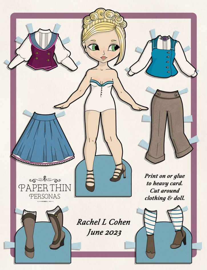
Download Color PDF | More 365 Paper Dolls
So, I decided to dip my toes into color in Procreate with this paper doll. I also did some experimentation with noise and backgrounds and other things.
While I wouldn’t recommend home printing for this one, because the ink usage will be through the roof, I have added a link to the PDF if you feel the urge to try to see what happens if you do.
You do you!
And if you do print it, it is scaled to mix and match with the 365 paper dolls.
I’ve been trying to sort out how to get texture. Of course, I think the effect doesn’t work super well unless you zoom in at which point, like maybe it doesn’t work at all?
Hmm….
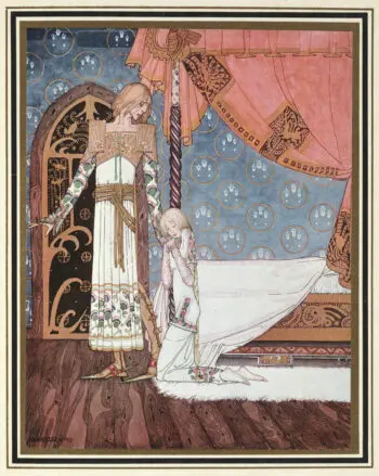
So, here’s what I was trying to mimic…
One of the things I love very much is the illustrations of the turn of the century. Generally done with a trichromatic printing process (sometimes black was added and sometimes green was added, which is fascinating in it’s own right), the screens used result in a very specific texture to the solid colors in the prints. You can see it in classic illustrators like Arthur Rackham, Kay Nielsen, or fashion illustrations from things like Bon Ton. You can see the texture I’m talking about here and here.
Anyway, trying to archive that effect digitally is not as simple as you might think. So I have been experimenting with noise and other texture effects in Photoshop and Procreate. The result, however, is probably not “strong” enough to be obvious. This is one of the problems of working digitally- you are zoomed in or zoomed out or… whatever. It’s actually super hard to tell what the finished product is going to look like at true scale.
The other factor is that digital printing introduces a bit of noise and I don’t like how it looks, but only because it feels unintentional and I really really value being intentional in my work. I want control, or an active lack of control (hello ceramics, I’m looking at you.)
As I keep saying on these posts, Julie has been a huge help in referring me to tools to try to get this effect.
There are many tools and brushes and things for Procreate that it is super overwhelming. There’s a million different tools and things you can do with those. But I suspect I’ll eventually find 3 or 4 I like and use them 90% of the time. That tends to be how I roll.
But you can’t find the three or four you like without trying out a few dozen, so that’s been the current challenge.
Next up, I’ll be sharing an experiment using a less smooth brush and seeing what happens when I have a “rough” line texture. More on that one next week.
Discover more from Paper Thin Personas
Subscribe to get the latest posts sent to your email.
I don’t know if you were happy with your results or not, but I gotta tell ya, I *love* this paper doll! The soft, 3 dimensional look is very appealing. I’m not sure from what you said whether you got the effect you were trying to, but I would love to see more done like this! I’m really enjoying your experimenting, and I really hope you are, too! 🙂
I am! It’s been really fun to just play a bit! I really do like how this one came out. I think the hair is particularly nice.
Just to say thank you and still following you.
Thank you
My pleasure! Happy to continue doing my thing in this little corner of the internet.